CASE STUDY

Giving a Local Pastaria the love it deserves

Pazzo Pastaria is a family-owned Italian restaurant based in San Antonio, Texas, known for its fresh, house-made pasta and welcoming atmosphere. This project consists of redesigning the usability and organizing the content of the original website to better represent the Archer family’s personality. Redesign of branding was done in a previous project. The goal was to create a warm, engaging platform that encourages reservations and captures the feeling of gathering around a table for a shared meal.

Scope: UX/UI Design, Website Design, Content Strategy
Tools: Elementor, WordPress, Figma
Timeline: 7 weeks

FINDING THE WHY

AUDIENCE

  • local families
  • couples
  • tourists, first-time visitors
  • young professionals, students
  • loyal customers

PURPOSE

Pazzo Pastaria needed a new website to better reflect the restaurant’s fun, cozy atmosphere. Additionally, to connect visitors to the founder’s story and get people to make a reservation.

INFORM

  • Menu, pricing, hours, location
  • Restaurant story

SHARE

  • The vibe of the restaurant
  • Quick info for convience
  • Visuals to help create emotion

Encourage

  • Website visitors to make a reservation
  • Get interested in the brand, food, and restaurant

GATHERING CONTENT

Organizing what goes into this site

Site Map used to organize pages and categories.

User Persona

Who are we making this site for?

user experience

Design Inspiration

How do we want the site to look and feel?

Wireframes

Sketches to get the perfect layout, trust the process!

sketch desktop wireframes
Desktop sketches
sketch mobile wireframes
Mobile sketches

PROTOTYPES

Designed in Figma

figma wireframes
figma prototypes

FINAL

Designed in WordPress with Elementor

pazzo pastaria website on laptop mockup

pazzo.creativejaz.com is complete

Reflection & results

We finished!

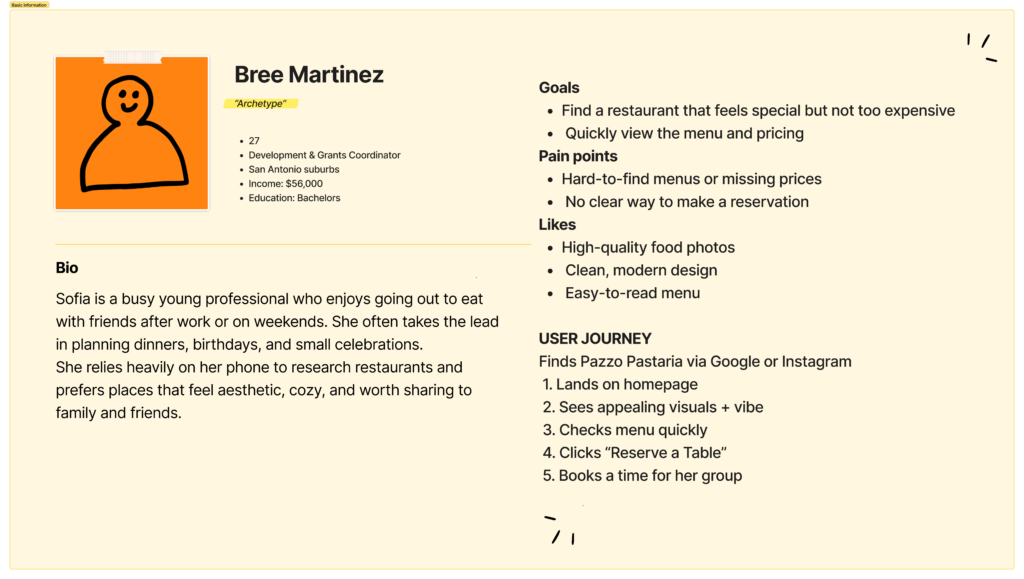
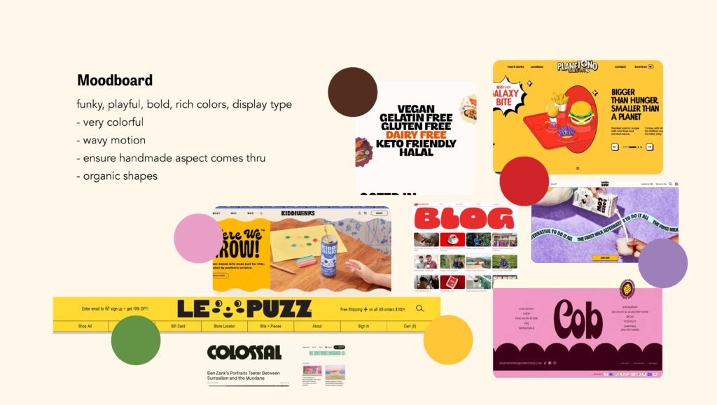
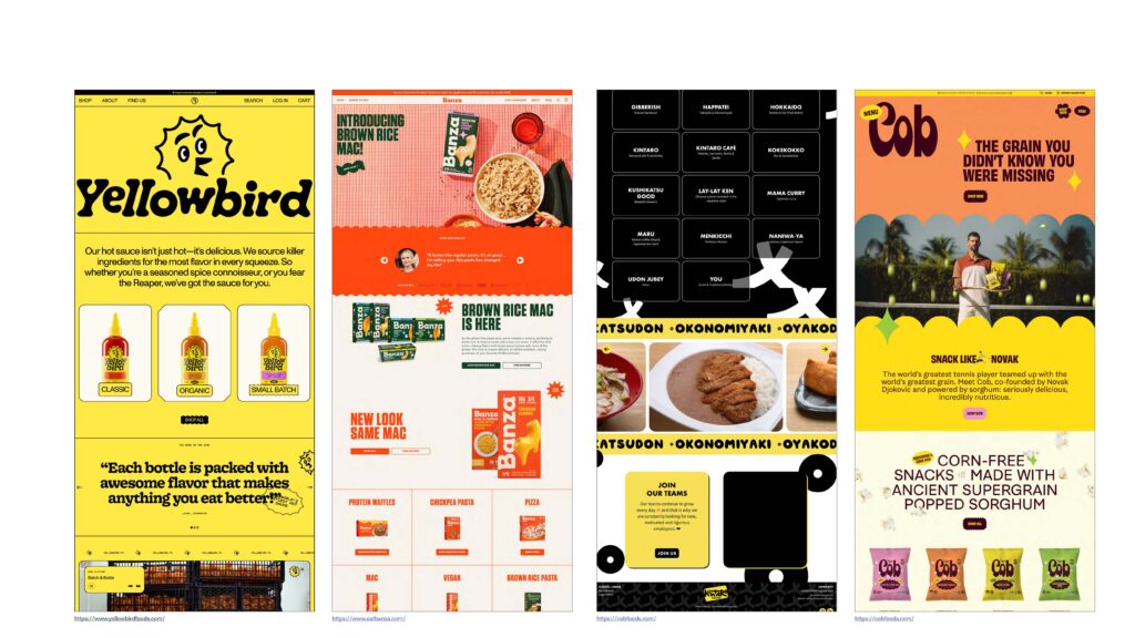
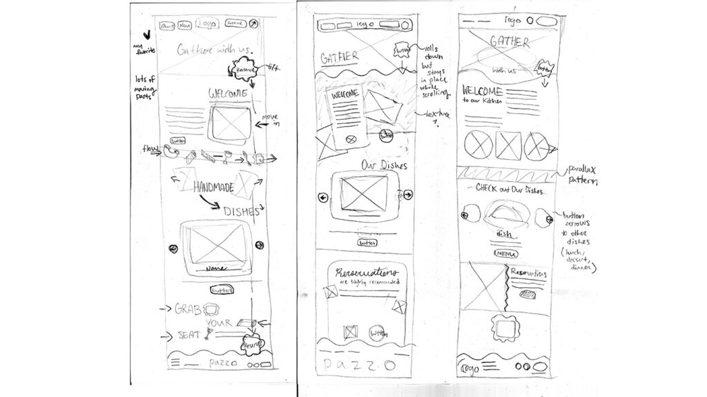
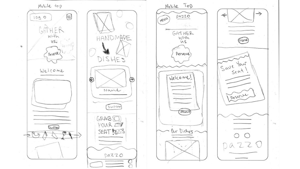
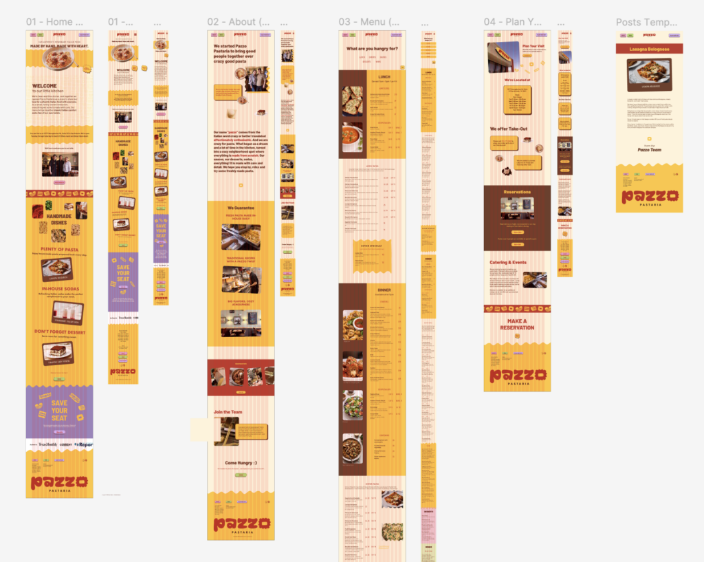
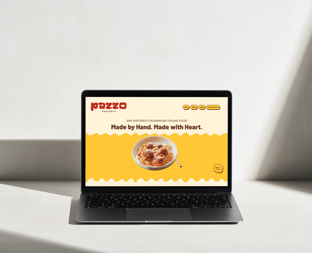
In designing the Pazzo Pastaria site, my main goal was to make a bold and fun site, like nothing I’ve designed for web before. Objectively, to get visitors to make a reservation. It was interesting to expand a brand identity I created last semester into web format, as every detail must be responsive. The learning curve was large, but taking each section at a time and the process our professor gave us helped me stay on track. I am satisfied with the site as I think it’s a good balance between function and aesthetics. If I were to improve anything, it would be the menu experience.